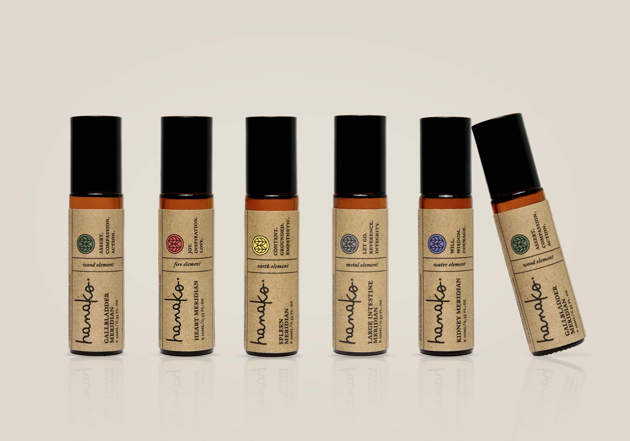
Hanako Therapies
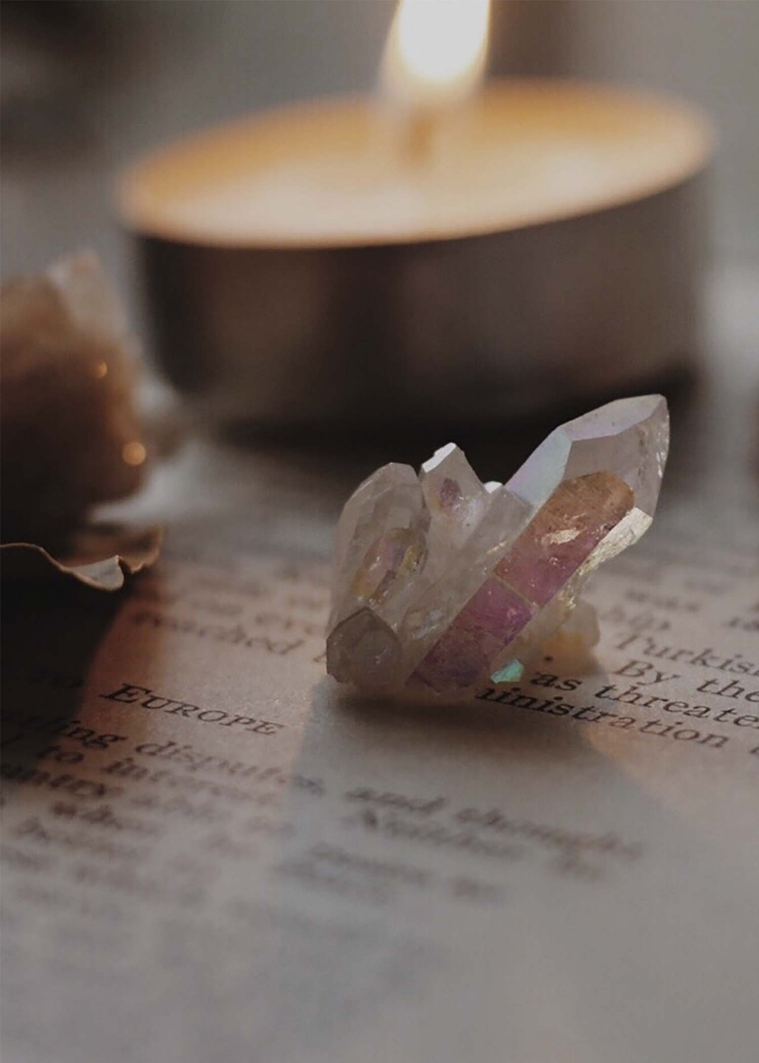
Honouring Mother Nature and the meaning of the word Hanako (‘flower child’ in Japanese) provided rich inspiration for launching this Australian business with a range of natural therapeutic products.
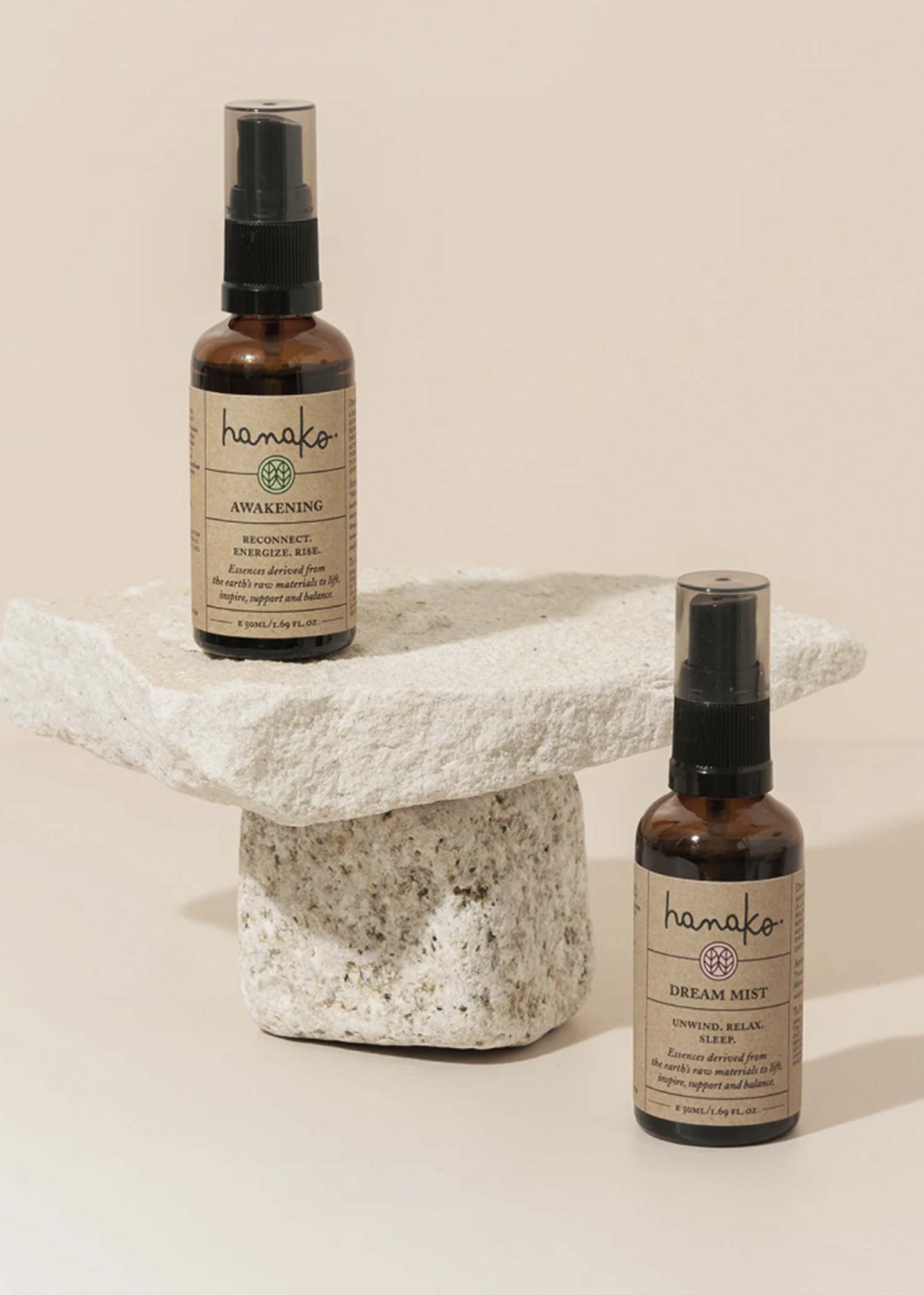
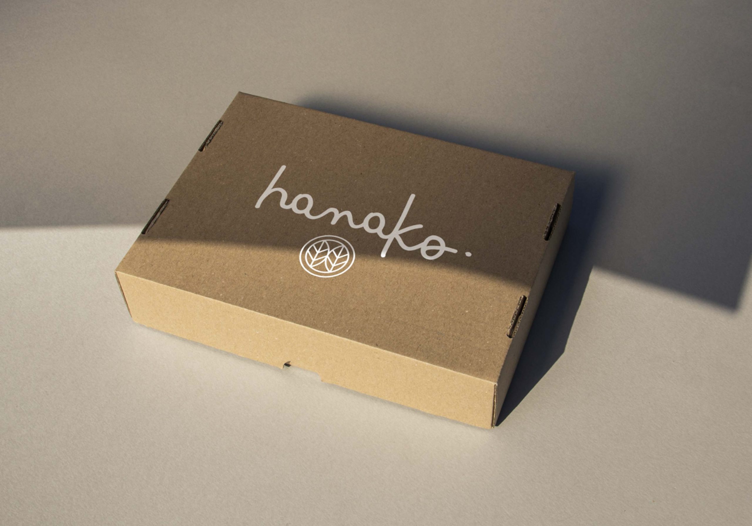
Our strategy was to distil the values, energy and ideology of the business to create an evergreen brand. We developed the logo and a packaging template for the core range of aromatic mists, vibrational essences and meridian blends.
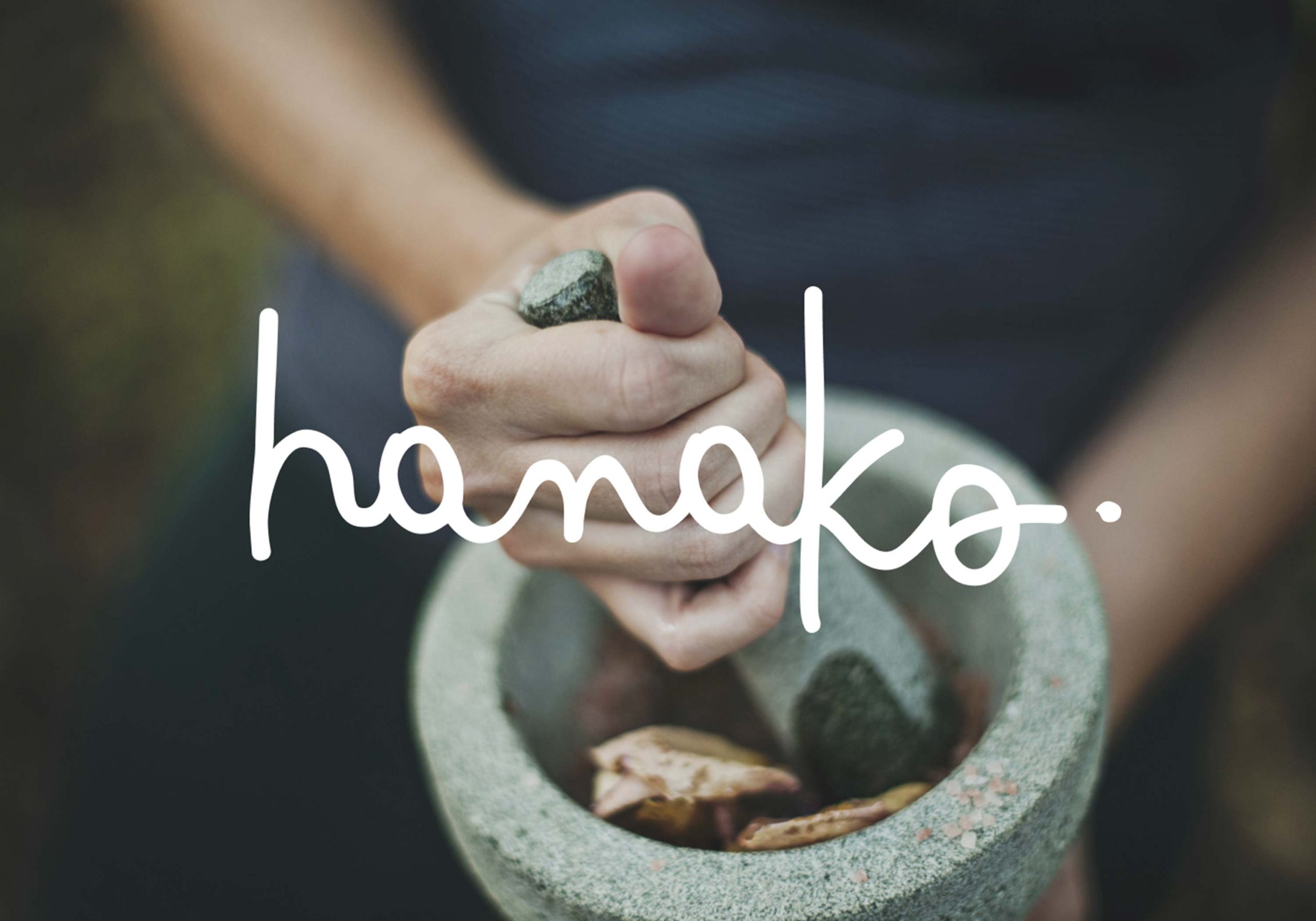
The logo script and leaf-inspired motif embody the natural, handcrafted and personal aspects of the business. The complementary graphics and guidelines and graphics deliver a robust toolkit which adapts as new products and formulations are released. This approach was both cost effective to maintain an affordable price point and adaptable for future growth.
- "Hanako needed a company with a clear vision, exceptional ideas and creativity. We definitely found it with Ikon, they took on the creative task quickly and decisively, delivering a beautiful look and feel to our brand and going above and beyond our expectations."Jeff Holm, Director, Hanako Therapies.