Totium
Working with Australia’s corporate A-list Totium offers a suite of medical-based services for enhancing businesses and the health of their people. The brand for this new enterprise was undertaken strategically after a series of collaborative workshops crystallising the organisational model, brand value proposition and ultimately the company name, Totium.
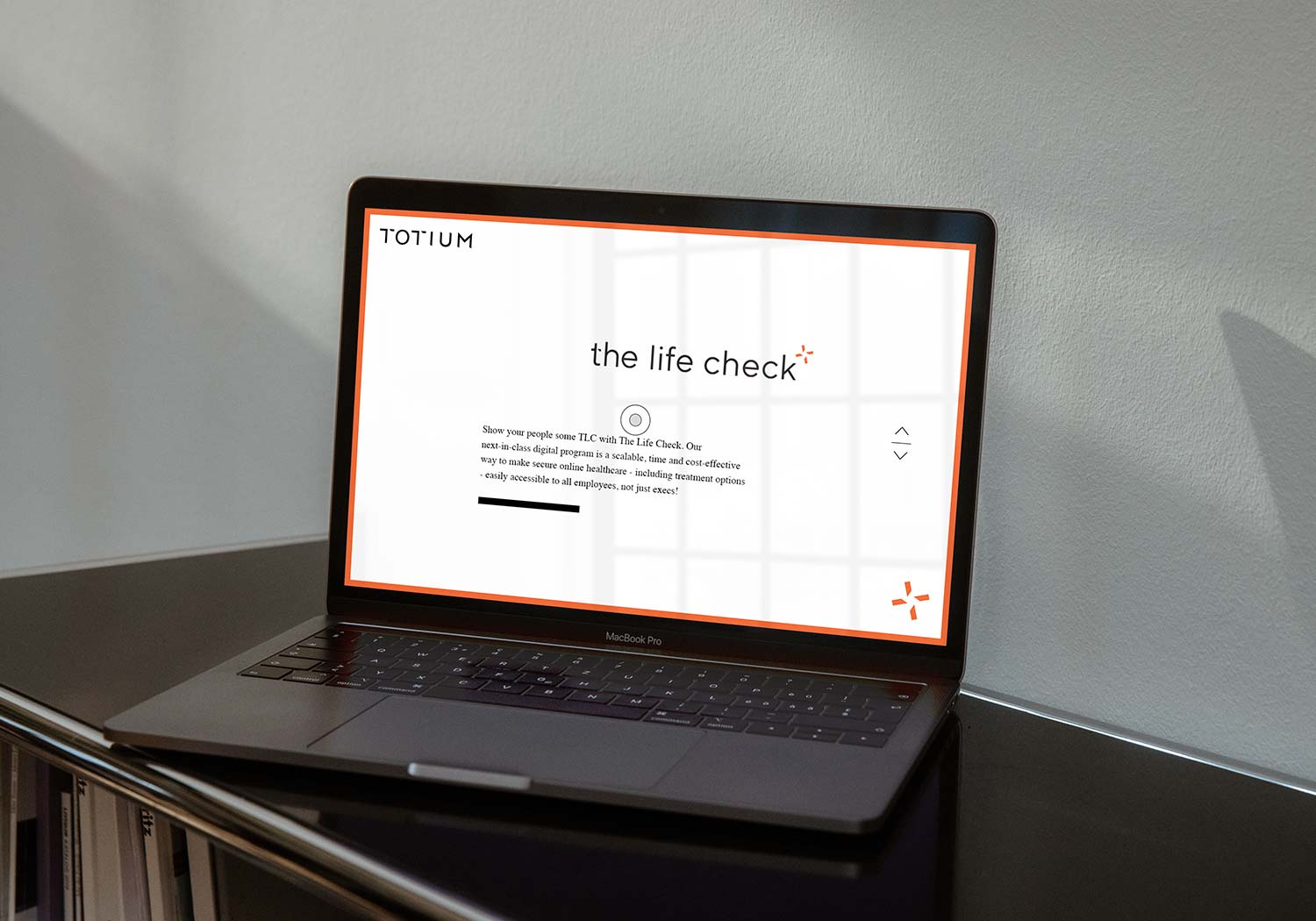
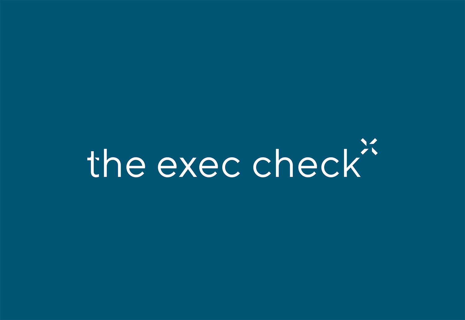
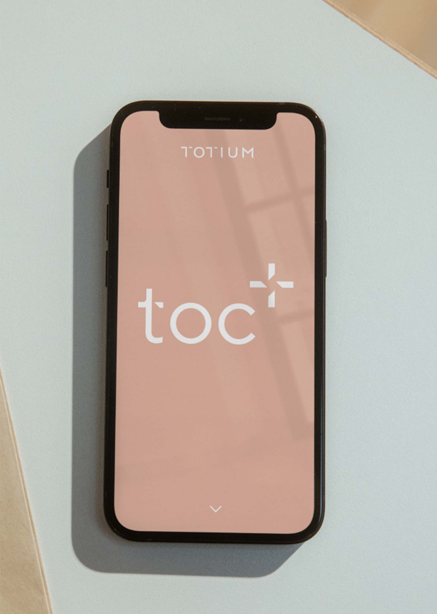
As a multi-faceted business it was critical that the Totium logo had capacity to support the suite of solutions on offer and communicate to a diverse audience – approachable yet clinical, friendly yet with the gravitas to appeal to a corporate clientele. The result is a bold, hand drawn wordmark and an icon which orientates to represent each key service. One of our key challenges was to distinguish these services, such as The Exec Check, The Onsite Clinic and The LifeCheck with clarity and vibrancy. A section of the T from the Totium logo creates this effective graphic device and is applied to the ’t’ for each title which also works to connect the brand.
As the foundation program of the Totium suite, The Life Check provides online health checks for employees and required its own graphic elements. We created an iconography subset with a clearly identifiable palette to align with each key stage of the process and providing a seamless user experience.
While fonts remain black, the accent colour palette is an upbeat spectrum of hues with an Australian vibe, an intentional departure from blues and greens typically favoured by medical marketers.